patrikbandak.com
Building patrikbandak.com.
I wanted somewhere to put the things I work on without turning my personal site into an online resume.
What started as a coming soon page turned into
a small site for my work, projects, ideas, and the somewhat
winding path that connects them.
Where it all began
Gotta start somewhere...
My brother bought the domain years ago and eventually transferred it to me when I asked. Shoutout to bandakpm.com.
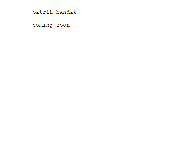
The first real version
The structure came before the answer.
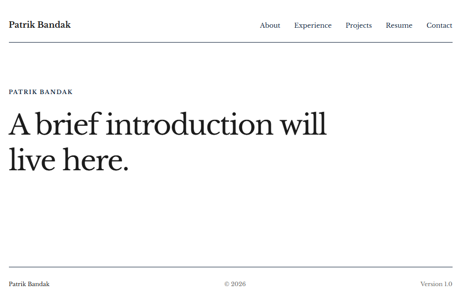
Within a few weeks I had Home, About, Experience, Projects, Resume, and Contact.
It worked, but the homepage still literally said, “A brief introduction will live here.” I had figured out the structure before I had figured out exactly what I wanted the site to say.
Positioning
Figuring out what the site was actually for.
The harder part was not building the pages. It was deciding what belonged on them.
My work has moved through banking, operations, implementations, product, technology, automation, and now AI. Listing all of that was accurate, but it did not explain much.
Eventually I landed on a much simpler idea: “I like to figure things out, then make them better.”
That gave me something broad enough to connect the work without trying to invent a label for myself.
Fine tuning
Getting it to feel like mine.
The visual direction took shape the same way: slowly, through a lot of small decisions.
Cream instead of white. Navy instead of black. Libre Baskerville for the parts that should feel more personal and editorial, Manrope for everything that needs to get out of the way.
Most of the site is intentionally simple. That made the small details matter more.
The logo and favicon went through several rounds. So did spacing, rules, typography, mobile behavior, and the navigation.
The mobile menu icon is probably my favorite example. It is a tiny hamburger that turns into a spinning X when the menu opens. We spent an unreasonable amount of time getting that little movement right.
Nobody is coming to the site because of the X. I still wanted the X to be right.
About
The About page got out of hand.
I started writing a normal About page and accidentally wrote an essay.
Cutting it down would have made it less interesting, so I went the other direction. I broke it into five chapters that can be scanned quickly and opened individually.
The first version gave each chapter its own card, led by a navy opener. I kept the chapter structure but removed the boxes, letting the titles and taglines carry the layout.
On desktop, a slim chapter list floats in the left rail and highlights the section in view. Opening a chapter still follows it into position on desktop and mobile.
Compare versions


Mobile
Making it actually work on mobile.
The desktop layout did not survive being squeezed onto a phone particularly gracefully.
I reworked the header, navigation, headline breaks, spacing, project layouts, and About interactions specifically for smaller screens. The content stayed the same, but several parts of the interface needed their own behavior.
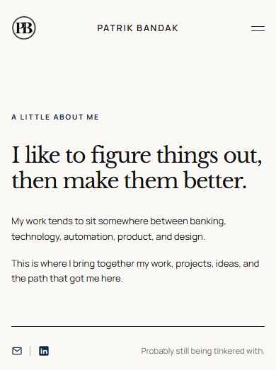
Building it
Most of it looked like this.
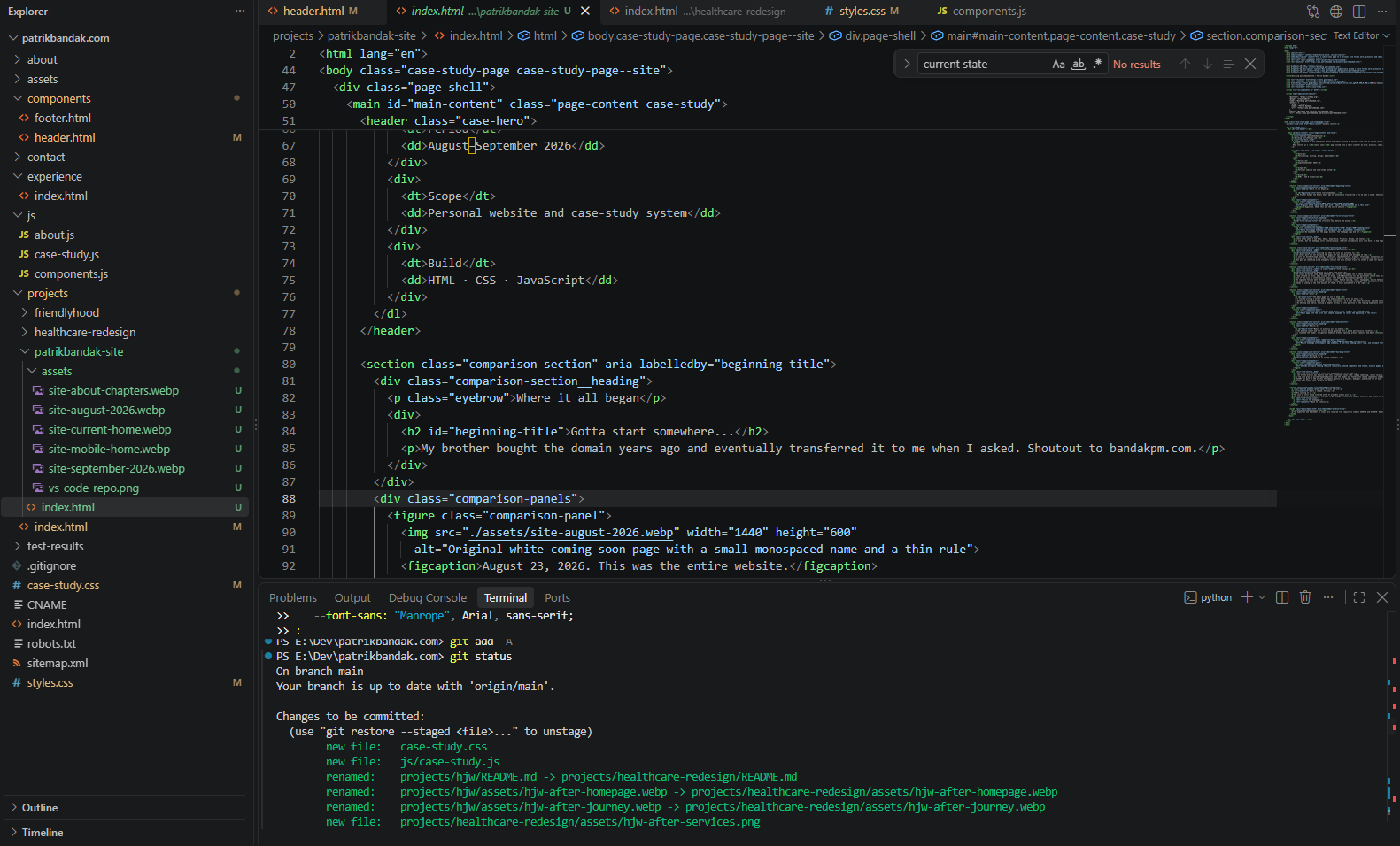
I built the site directly in HTML, CSS, and JavaScript in VS Code.
A lot of the process was exactly what this screenshot looks like: change something, run it locally, stare at it, change three more things, break something unrelated, fix that, and eventually commit it.
As the site grew, I pulled repeated pieces like the header and footer into shared components and built a reusable case-study system so new project pages could inherit the same structure without becoming copies of one another.
ChatGPT was part of the process throughout, mostly as a teacher, debugger, and second set of eyes. After I had already established the site, the visual system, and the case-study components, I also used Work once to assemble one page from the structure and material I gave it, then took it back over for the final pass.
Easter eggs coming soon, because why not?
Version 1.0-ish
Where I landed. For now.
You’re looking at it.
The site is still being tinkered with. It probably always will be.
But now there is somewhere for the work to go, enough structure to keep it coherent, and plenty of room for whatever I decide to build next.